

When should you use which variant of the line chart in Power BI?
The line chart is one of the most commonly used visualizations in Power BI. However, people often stick to one standard variant, even though Power BI offers several forms, each of which tells a different story. By consciously choosing the right variant, you can prevent misinterpretation and make trends easier to read.
In this blog, I will take you through the four most commonly used variants:
- the classic line chart
- the area chart
- the stacked area chart
- the 100% stacked area chart
You will learn what they do, when to use them, and when not to.
The classic line chart
The standard line chart shows the development of a value over time. Think of monthly sales, number of sick leave reports per week, or daily stock levels. The strength of this type lies in its simplicity: one or more lines that show the trend without distraction.
Use this chart when the trend is the focus. You want to see whether something is rising, falling, or remaining stable. It works best with a limited number of lines, so that the overview is maintained. As soon as you add too many categories, it becomes difficult to interpret.
Do not use this type if you mainly want to show the composition of totals. Another variant is better suited for this.
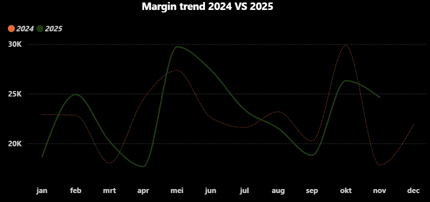
This line chart shows the margin trend over time, comparing the actual margin with the budget for 2024 and 2025. By showing both lines side by side, you can see at a glance where performance deviates from expectations.
The chart clearly shows trends, peaks, and troughs and indicates the periods in which the margin is structurally above or below budget. This is ideal when the development over time is more important than the exact monthly value.
The area chart
The area chart is very similar to the classic line chart, but adds a colored area below the line. This gives the volume more weight in the visual. This helps when you want to show not only the direction of the trend, but also its magnitude.
An area chart works well with financial values such as turnover or margin, especially when you want to compare the trend over several years with, for example, a budget line. The area makes it clear that it is about “quantity,” not just movement.
Do not use this variant if you want to compare multiple categories at the same time. The area can then quickly overlap and become cluttered.
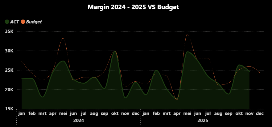
A surface chart with margin shows at a glance how the margin develops over time, with extra emphasis on the size of that margin. The colored surface not only shows increases and decreases, but also where the margin is structurally higher or lower.
This makes the chart particularly suitable for identifying trends, peaks, and troughs and for comparing developments over multiple periods without focusing on exact values.
The stacked area chart
The stacked area chart shows how different components together form a total over time. Each category is given its own area, which are stacked on top of each other. This allows you to see both the total and the contribution of the individual components.
This type is particularly suitable for analyzing seasonal patterns and shifts in composition. Think of sales per product group, hours per department, or costs per cost type throughout the year.
It is important that you use this chart for analysis, not for exact comparisons between categories. The upper areas are more difficult to read because they do not have a fixed zero line.
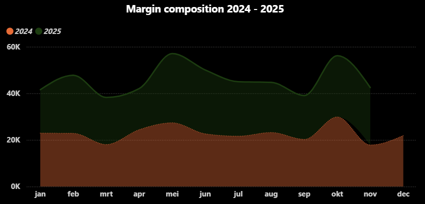
This line chart shows how the total margin is made up over several years and how this structure develops over time. You can see both the total size and the contribution of each year separately in a single image.
This makes the chart suitable for recognizing seasonal patterns and analyzing whether growth or decline comes mainly from one year or from both.
The 100% stacked area chart
The 100% stacked area chart normalizes the total to 100%. This means you no longer see how large the total is, but how the distribution develops over time. Each period counts equally, regardless of the absolute value.
This variant is ideal when you want to analyze whether ratios are changing. For example: does margin A contribute relatively more this year than last year? Or is there a shift in the share of fixed versus variable costs?
Do not use this type when absolute growth or decline is important. That information is deliberately omitted from the visual.
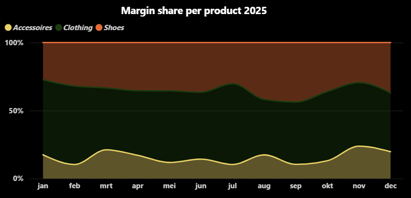
The 100% stacked line chart does not focus on absolute amounts, but on ratios. The chart shows the share of each product in the total margin for 2025 and how that distribution shifts over time.
This quickly reveals which products are gaining or losing importance, regardless of the total margin.
Which variant should you choose and when?
A simple rule of thumb helps you make the right choice:
Do you mainly want to see trends?
Do you want to emphasize trends and volume?
Do you want to analyze the composition of the total?
Do you want to compare ratios?
→ choose a line chart
→ choose an area chart
→ choose a stacked area chart
→ choose a 100% stacked area chart
By making this choice consciously, you prevent your dashboard from looking nice but causing confusion in terms of content.
Learn how to use moving average in Power BI
Many line chart variants become significantly more insightful when combined with analytical techniques such as a moving average. Especially in standard line charts, a moving average helps to smooth out short-term fluctuations and reveal the underlying trend.
In the free module Moving Average in Power BI I show step-by-step how to create a moving average using DAX, how it behaves in visuals, and how to apply it in real-world scenarios. This makes it a natural next step if you want to move from visual comparison to deeper trend analysis.